Pages

Saturday 15 March 2014

Xolo Q1100 review

Xolo_Q1100_angle_ndtv.jpg
There's no real doubt that Indian smartphone brands are giving established international companies a run for their money, but the argument that they're only able to do so by selling cheap, poorly manufactured products might not be able to hold water for very much longer. Xolo is one of a small handful of companies that isn't in a race to the bottom, and its products of late have been quite respectable in terms of looks and build quality.
Xolo has made a number of intelligent choices with its latest model, the Q1100. Its design, features and specifications are all understated and well thought out. There are no outrageous features, such as a full-HD screen or octa-core processor, which seem to be trendy things to boast about right now. Instead, there's a well-balanced set of specifications - the kind of thing buyers should really care about.
Xolo_Q1100_curves_ndtv.jpg
We're curious to see how the Xolo Q1100 holds up in our benchmark suite, and whether Xolo's subtle approach will pay off.
Look and feel
The Q1100 looks great, with a simple all-black body and unassuming profile. The plastic surrounding the front panel glass extends over the bottom edge like a curved lip, breaking up an otherwise ordinary rectangular shape.
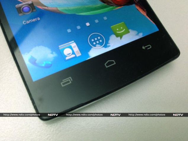
The front face is almost completely dark. With the screen off, you can just about make out the outlines of the three capacitive Android buttons below the screen. Above it, there's a rather prominent Xolo logo (which we could have done without), and the clearly visible front camera.
Xolo_Q1100_camera_ndtv.jpg
The rear shell is made of plastic with a soft-touch coating. We're not sure how long the coating will last, as these tend to either peel off or become oily over time, but it does look good out of the box. It's also very smooth; we would have preferred something a little easier to grip.
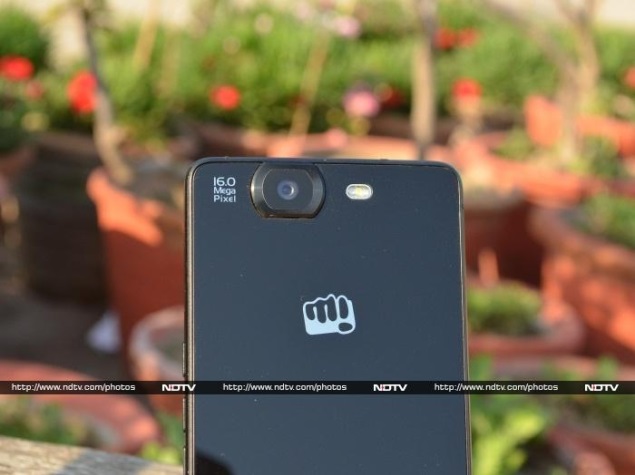
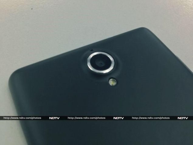
The shell extends around the top and sides of the Q1100. The power button on the right and volume rocker on the left are actually built into the shell, and come off with it. The rear is also quite bare, apart from a small speaker grille on the bottom, a silver embossed Xolo logo right in the middle, and the camera lens and flash near the top. The camera sticks out about a millimetre beyond the rest of the body, and is surrounded by a bright silver ring.
Xolo_Q1100_buttons_ndtv.jpg
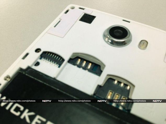
There's small notch on the bottom of the right edge which you can use to pry the shell off, with a fingernail. A series of tiny plastic tabs around the edges hold it in place. This is the only complaint we have about the build quality of the Q1100, because it doesn't always line up perfectly, and the plastic tabs at the top stick out unless you pay close attention when snapping the shell on. The plastic is also a little creaky, and you we could hear it flex when picking up the phone or shifting our grip.
Apart from that, we're pretty impressed with the Q1100. It fits nicely in one hand, despite having a 5-inch screen. The proportions and weight also feel just about right. A lot of people who automatically dismiss Indian brands or think they would never be seen dead with a "cheap" phone should give this model a second look.
Xolo_Q1100_cover_ndtv.jpg
Features and specifications
The most interesting thing about the Q1100 is that it is based on a Qualcomm Snapdragon 400 system-on-a-chip (SoC), as opposed to the lower-performance chips from MediaTek and other smaller companies that are prevalent not only at this price point, but also at higher prices. Unfortunately, the perception that more cores are better has become quite firmly entrenched in the market, and so with quad-core processors becoming somewhat common, manufacturers are only too happy to produce octa-core models.
The simple fact is that not all cores are built the same, and so it doesn't really matter how many of them you have if they aren't doing all that much work. The octa-core models we've reviewed so far have excelled in certain CPU-bound tests, but their real-world performance has not been noticeably better than that of high-end quad-core models.
Xolo_Q1100_left_ndtv.jpg
Additionally, many phone makers seem happy to focus only on core count while ignoring other facets of a processor, such as its graphics capabilities. On the whole, MediaTek's chips have not been able to match Qualcomm's in gaming and graphics-heavy tests.
Thus, the Qualcomm Snapdragon 400 is a sensible choice, rather than one that will produce breathless headlines. This SoC was designed specifically for mid-budget smartphones, and its four Krait processor cores run at 1.4GHz, along with a 450MHz Adreno 305 GPU.
The processor is supported by 1GB of RAM, 8GB of built-in storage, and a 2,000mAh lithium-ion battery. The screen resolution is 720x1280; not quite full-HD, but decent enough by most standards, especially for a budget phone. You also get AGPS, Wi-Fi b/g/n and Bluetooth 3.0.
Xolo_Q1100_right_ndtv.jpg
Interestingly, the Q1100 comes with Android 4.3, rather than 4.2, which seems to be the version most budget manufacturers are stuck on. Xolo doesn't do much customisation in terms of visual appearance, but it does bundle a few apps, including its own Xolo Power and Xolo Secure, which you can read about in detail in our review of the Q3000.
There are also two very interesting apps for Indian users. Reverie Phonebook can display your contacts transliterated into Hindi, Gujarati, Punjabi, Tamil, Telegu, Kannada or Malayalam. The interface is a bit unpolished, and spellings aren't perfect, but this is exactly the sort of thing that could really come in handy for users who aren't comfortable with English interfaces.
The other app is called TransPic, and its purpose is to translate or transliterate Hindi text into English script. The instructions within the app aren't very clear, and we couldn't detect any difference between online and offline mode. We also found that we needed to get pretty close to text on a page, which meant we couldn't always fit a full line or paragraph into each frame. Recognition accuracy was pretty impressive and there's even a button that will read out recognised text, which is just another example of how this app could prove to be very useful to non-English speakers.
Xolo_Q1100_hindi1.jpg
Xolo_Q1100_hindi2.jpg
Camera
Whereas most of the phone interface is pretty polished, the camera app has a very odd series of menus with far too many seemingly random options. There's only a single control button in the camera interface, which brings up a menu with icons for HDR mode, the timer, and swapping between the front and rear camera, as well as three submenus with identical icons.
The first of these contains options for photo storage location, scene mode, picture size, zero shutter lag, and even a giant histogram that blocks nearly half the screen. The second offers colour effects, toggles for face detection and touch AF, exposure options, and sliders for saturation, contrast and sharpness. The third lets you choose an ISO value, AE bracketing, red eye reduction, exposure compensation, a filter called "wavelet denoise mode", and finally the flash.
Xolo_Q1100_camera_interface.jpg
It's a bit odd that the flash and scene controls aren't accessible more easily. Between Xolo and Google, this camera app is in serious need of an overhaul.
Photos taken with the Q1100 outdoors in broad daylight were surprisingly good, with sharp focus and low noise. There's a bit of a red colour cast, but nothing too serious. Unfortunately, when fully zoomed in, you'll be able to detect excessive compression, which gives people and objects a slightly artificial look.
Photos taken indoors were a bit noisier, but detail was still clearly discernible and focusing was accurate. In darker conditions, things were a lot worse. Still, we have to remind ourselves of this phone's cost, and measure our expectations accordingly.
Xolo_Q1100_camera_sample.jpg
(Click to see full size)
We found videos shot with this phone came out a bit too dark, and moving objects weren't clear enough for our liking. You shouldn't use this phone for anything more than casual clips now and then.
Performance
We were happy to see that Xolo's choice of a Qualcomm processor over a MediaTek one has paid off. Performance in our benchmarks was quite impressive, especially the graphics and gaming tests. We achieved scores of 18,953 in AnTuTu, and 9,397 overall in Quadrant. 3DMark's 720p Ice Storm scenario returned a score of 5644 points, while GFXBench managed to run at 10.6fps. This indicates a better balance of power between graphics and core processing than we are used to seeing.
Temple Run 2 and other casual titles ran without a hitch, so you should be able to run medium-intensity games at decent quality on the Xolo Q1100. When we tried watching 1080p HD videos, we noticed a bit of lag in heavily detailed scenes and when skipping around the timeline in some of our clips, which was a minor letdown. 720p clips played just fine, though. Audio volume was a bit underwhelming, but we had no complaints with regard to the clarity.
The Q1100's battery life was perhaps the biggest disappointment we faced. It lasted only 3 hours and 33 minutes in our video playback loop test, which does not bode well for performance in the real world. We wouldn't expect to get a full day of even moderate usage out of this device.
Xolo_Q1100_flat_ndtv.jpg
Verdict
Xolo has done a great job of upping the ante in terms of appeal. Even if you staunchly believe that you'll never buy a phone from an Indian brand (regardless of where it is actually manufactured), you'd be tempted to give the Q1100 a second look. In addition, it doesn't skimp where it really matters, which is the processor. Finally, there's the price to consider.
If there was no real competition at around the same price point, we'd be happy to recommend the Xolo Q1100, but unfortunately for it, this phone is up against the 16GB Motorola Moto G, which uses the same processor, and the Micromax Canvas Turbo Mini, which has far better battery life. The Moto G has been our favourite ever since we reviewed it, and frankly, the Xolo Q1100 hasn't managed to significantly outshine it at anything. Even the Turbo Mini, which lags in most benchmark scores, offers way better battery life.
Xolo_Q1100_box_ndtv.jpg
So even though we like the Q1100, we aren't a hundred percent enthusiastic about recommending it to potential buyers. The build quality issues are minor, and we can live with a little creaking now and then. What truly concerns us is the battery life. It's no good to have a smart-looking phone with a capable processor if there's no juice to run anything on. No one wants to walk around all day with a charger or external battery, and so despite everything else that Xolo has achieved, the poor battery life is this phone's Achilles heel.

Xolo Q1100

Rs. 14999
  • Design
  • Display
  • Software
  • Performance
  • Battery life
  • Camera
  • Value for money
  • Good
  • Good looks
  • Good performance
  • Value for money
  • Bad
  • Poor battery life
  • Minor construction quality issues
0 comments

Friday 14 March 2014

Asus Chromebox review: Great streaming device

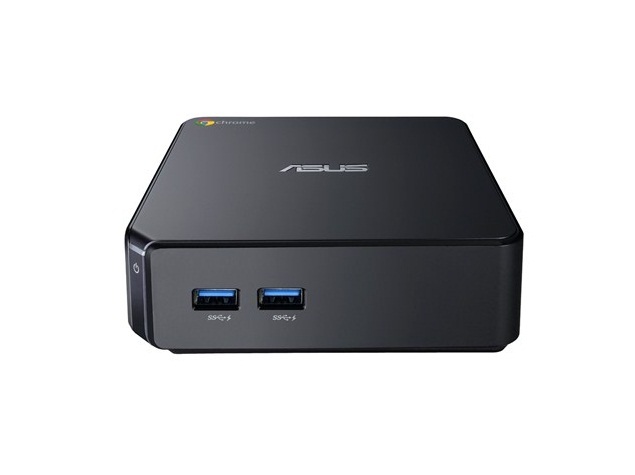
asus_chromebox_front_amazon.jpg
Devices that let you watch Netflix and other streaming video services on a big TV screen are popular, but there are limits to what you can watch.
NBC, for instance, didn't make its Olympics apps compatible with Roku, Apple TV and Google'sChromecast (Review). With HBO Go, Comcast subscribers can use Apple TV but not Roku, while it's the other way around for Charter's customers. And with all of these devices, you need an $8-a-month Hulu subscription to watch what you can get for free using desktop computers.
The Internet is the Internet. It shouldn't matter what gadget you're using. But content providers worry that if they make the video streaming experience too much like regular TV, they'll discourage people from watching old-fashioned commercial and pay TV.
So I'm pleased to find a legal way around these restrictions with a new device called the Chromebox.
AsusTek Computer Inc. will start selling it March 28 at a starting price of $179. A version with a faster processor and support for ultra-high-definition video, also known as 4K, will be available in April for $369. That model includes a wireless keyboard and mouse; otherwise, the package is sold separately for $50.
To call the Chromebox a streaming device does it injustice. It's a full-powered desktop computer running Google's Chrome OS system. I'll get into the pros and cons of that later.
You can connect the Chromebox to a standard monitor just like any other desktop. Like other newer desktops, the Chromebox also has an HDMI port to connect to high-definition TVs. That makes it tempting to turn the Chromebox into a streaming device.
With most streaming devices, you need apps for individual services such as Netflix and HBO Go. If there's no app for that service, you can't watch it on the big screen for the most part. That's one of the big shortcomings with Google's Chromecast streaming device. Even though it's just $35, the list of services it supports is paltry.
By contrast, Chromebox works just like any other computer. As long as you can watch something in a Web browser, you can watch it on the big screen.
You can technically do that with any desktop computer if it has an HDMI port or if you get an adapter. Mac computers also have a feature called AirPlay to mirror the display through an Apple TV and your Wi-Fi network.
But those computers typically cost hundreds or even thousands of dollars. The Chromebox is just $80 more than a Roku 3 (Review) or an Apple TV, and it lets you watch -and do- much more.
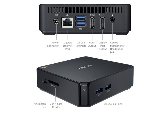
asus_chromebox_details_official.jpg
I've managed to use the Chromebox to watch plenty of free Hulu offerings, replays of Olympics figure skating and some shows from ABC Family, a channel otherwise unavailable on streaming devices. Video is sometimes jerky and the audio sometimes out of sync, but that's something I get on other devices, too.
As I mentioned earlier, Chromebox is much more than a streaming device. Because it runs Google's Chrome OS, it comes with a Google's Chrome Web browser and numerous apps for Google services, including GmailGoogle MapsYouTube and Hangouts chats. You can get apps for non-Google services, too, but not as many as you'd find for Windows and Mac computers.
Chrome OS is ideal for those who use a lot of Google services or can otherwise get what they need over a Web browser. That includes research for homework, checking Facebook and using Web-based email.
If you need professional apps such as Adobe's Photoshop or Microsoft's Office, look elsewhere. The tools available with Chrome OS are adequate for basic functions, but they aren't robust.
Another shortcoming of Chrome OS is its need for a constant Internet connection. Many apps don't work well or at all without that. That's more of a problem with Chrome OS laptops meant for use outside the home. You should never need to separate your Chromebox from the Internet.
Chromebox also has a new Chrome OS feature that lets you create supervised log-ins for your kids. You can choose to block certain sites or permit surfing of only pre-approved sites. You can also see a list of what your kid tried to visit.
Unlike parental control software from outside parties, Chrome OS doesn't try to impose a default list of approved or banned sites. It requires more work to configure, but it lets parents decide what's appropriate.
Chromebox works nicely as a secondary computer that family members share.
chromebox_slots_official.jpg
Besides the dual display ports, Chromebox has four USB 3.0 ports for printers and other peripherals, a slot for camera memory cards and an Ethernet port for wired Internet connections. It also has Wi-Fi, but not the newer, faster type known as 802.11ac.
My one complaint: You'll have to decide whether you want to use the Chromebox as a general-purpose computer or as a streaming device.
I recommend getting the wireless keyboard and mouse for streaming. Otherwise, the keyboard and mouse would be physically attached to the Chromebox, which sits closer to the TV than to you.
But that setup doesn't work well for general computing. I find text too small to read on a 42-inch (106-centimeter) TV that's 8 or 10 feet away. For general computing, you'll want a smaller screen and you'll want to be closer to it. But then it's no different from watching streaming video on a regular computer.
Of course, the Chromebox is cheap enough that you can buy two. But if you have to choose, consider this: There are plenty of other desktops for general computing, but few affordable enough to use just for streaming.
0 comments

Wednesday 12 March 2014

Micromax Canvas Knight review

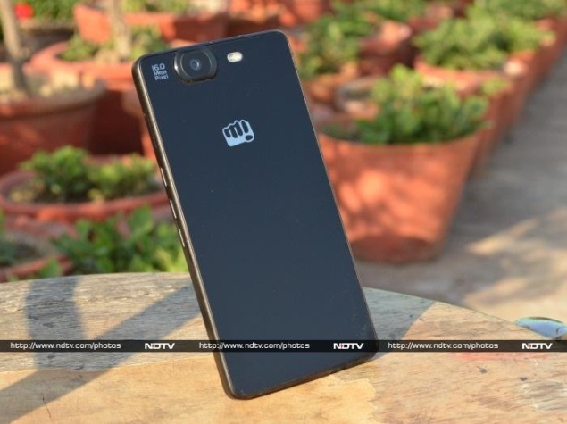
micromax_canvas_knight_rear_panel_ndtv.jpg
Micromax's Canvas smartphone series has been considered by many to be the best thing that the popular Indian handset maker has ever done. After forging a formidable reputation for itself in the budget Android smartphone segment, Micromax of late has begun to aim a bit higher, with products such as the Canvas Doodle 2 (Review) and Canvas Turbo (Review).
After lots of speculation, Micromax has now finally bitten the octa-core bullet and has done so with a vengeance in terms of both specifications and price with its latest launch, the Canvas Knight. Just as PC makers used to boast about the clock speed of the processors powering their devices, smartphone manufacturers are now doing the same.
The Canvas Knight is the first smartphone from Micromax's stable to use MediaTek's octa-core MT6592T chip, which is an upgraded variant of the MT6592. But does the Micromax Canvas Knight, with its octa-core processor and full-HD display, pack enough punch to overcome heavyweights like Samsung, Sony and HTC in an increasingly competitive market? We took it for a spin to find out.
Look and feel
The first thing that you will notice about the Micromax Canvas Knight is its refreshed design; however in many ways, it reminds us of another device, the Xperia Z.
Our immediate reaction after we took the smartphone out of the box was: we have seen something similar before. We would not be totally wrong to say that the Canvas Knight is inspired by Sony's former flagship smartphone, the Sony Xperia Z, while the sides look a bit reminiscent of an Apple iPhone 5 or iPhone 5s.
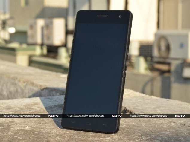
micromax_canvas_knight_front_panel_ndtv.jpg
The front and rear panels noticeably borrow design cues from the Xperia Z (Review). However, a closer look at the Canvas Knight reveals differences. For instance, it doesn't have a rounded power button on the right panel, which is a hallmark of the current Xperia aesthetic, and the camera placement is also different. Next, there is no physical camera button on the Canvas Knight, unlike the Xperia Z.
The rear panel is dominated by a big slab of glass that curves nicely till the bezel at the sides, much like the Sony Xperia Z's rear panel which is non-removable.It arches outwards gently, with a 16-megapixel camera accompanied by an LED flash right on top. We wish Micromax had provided a layer of protection for the protruding rear camera.
micromax_canvas_knight_right_panel_ndtv.jpg
The Canvas Knight's side panels feature rounded edges and metal styling, which at times reminded us of the iPhone design. The glass rear and metal styling on the edges of the Canvas Knight is impressive and gives a premium feel to the device.
The front is totally dominated by a 5-inch touchscreen. There are no physical buttons on the front of the phone; only three soft touch keys below the screen which become visible when it's in use. The Canvas Knight also has a secondary camera which is placed above the screen and to the right.
micromax_canvas_knight_earpiece_grill_ndtv.jpg
The 3.5mm audio jack is placed on the top panel, whereas the volume rocker keys and power button are on the right side.The two SIM card slots are placed on either side. All of these blend smoothly into the phone's frame. The Micro-USB charging port is placed on the bottom, alongside an elongated speaker grille.
We were disappointed to see the power button of the Canvas Knight placed a bit low on the right edge; we wish it had been placed a little higher,which would have made it easier to hit. We ended up pressing the volume up button instead of the power key quite often, thanks to their awkward placement.
Both the front and back panels of the Canvas Knight are dominated by glass, so we expected at least Corning Gorilla Glass for protection.
micromax_canvas_knight_browser_ndtv.jpg
The Canvas Knight is surprisingly compact for a device with 5-inch screen, and although it is hardly super thin, it easily fits in most hands. However, stretching a thumb all the way across the screen feels awkward at best, unless you have big palms.
We have always been fascinated by new designs in the devices we see, and as far as looks go, the Canvas Knight is a complete departure from company's previous smartphones. We were impressed to see a new design sensibility applied by Micromax for this device.
No, the Micromax Canvas Knight does not scream 'cutting edge' but it is all about understated class. Just remember to keep a cloth handy to wipe fingerprints off the glass. On the whole, the Canvas Knight is a very handsome package.
Screen
The Micromax Canvas Knight features a 5-inch full-HD IPS screen with a resolution of 1080x1920 pixels and an impressive pixel density of 443ppi (pixels-per-inch).
In terms of performance, the screen offers vibrant colours and respectable contrast. Viewing angles aren't so great, but still pretty decent for a phone in this price range.
Unfortunately, Micromax has given a miss to toughened glass that resists scratches, which was not expected since it's a relatively high-end phone. Notably, Motorola used Corning Gorilla Glass 3 on theMoto G's screen and it is still cheaper than the Canvas Knight.
micromax_canvas_knight_getit_app_ndtv.jpg
The IPS screen doesn't give the fullest colours or the deepest blacks like the Samsung's high-end Galaxy smartphones with Super AMOLED would, but the panel is bright enough nearly all the time.
The resolution and pixel density of the Canvas Knight is also far higher than some of its competitors in this price segment, such as the Nexus 4 and Samsung Galaxy S4 mini. Touch sensitivity is impressive and we did not encounter any issues while using the device.
The Canvas Knight's screen produced bright whites and vibrant colours. Images and text look sharp. Readability in direct sunlight was good, but only with brightness set to the highest level.
The screen is also highly reflective. In day-to-day use at regular brightness levels, the Canvas Knight's screen will offer higher quality than an average user expects.
Camera
The Micromax Canvas Knight sports a 16-megapixel autofocus rear camera with electronic image stabilization (EIS) and a M8 Largan lens, which the company touts, can capture high resolution images in rapid succession.
micromax_canvas_knight_rear_camera_ndtv.jpg
The camera app carries forward a lot of features from the company's previous Canvas models, including a customisable quick menu which includes controls for switching between the front and rear cameras, turning on the Intelligent Auto (flash) mode, switching between Normal, Panorama, HDR, Scene Detection, and Smile photo shot modes, and for accessing the deeper camera settings.
Notably, the Canvas Knight offers the same settings for voice activated shutter which are found on some high-end smartphones from LG, Samsung and Sony, which lets you take pictures with voice commands such as 'cheese' or 'capture'.
micromax_canvas_knight_camera_screenshot.jpg
The camera app on Canvas Knight also offers options like focus, zoom, brightness, image size, scene modes, ISO, white balance, colour effects, timer, geo-tagging, shutter sound and image storage. Video can be recorded at 1080p.
The continuous or burst shot mode takes up to 99 images in one go when you press the on-screen button.
We tested the Canvas Knight's rear camera in outdoor, dim and indoor conditions and found that it produced very good results in well-lit conditions and even did reasonably well when the lights dimmed, although we recommend using the flash only when it gets really dark.
micromax_canvas_knight_camera_sample_ndtv.jpg
Daylight shots came out well except that colours were a little over-saturated and at times there was noise at edges; you can also see missing details if you zoom in to a saved image. However, the indoor and dim light shots did show a quality drop, and images weren't as crisp as those taken in well-lit situations.
The smartphone also features an 8-megapixel fixed focus front facing camera that can be very handy for selfies and video chats. We found videos and images captured with this camera indoors and even outdoors a bit grainy.
Software/ Interface
At a time when the world is expecting Android KitKat on modern phones, Micromax has stuck with Android 4.2.2 Jelly Bean for the Micromax Canvas Knight, which is extremely disappointing. Considering that Android 4.4KitKat has been out in the market for quite a while, we hope that Micromax soon rolls out an update to at least Android 4.3 Jelly Bean.
Further, the Canvas Knight does not run the stock version of the OS. Micromax has customised the UI, skinning some elements such as the notification tray, besides including additional apps, widgets and features.
micromax_canvas_knight_screenshot_homescreen.jpg
There's no doubt that the UI skin on the Canvas Knight is not as radical as Sony's XperiaUI or Samsung's TouchWiz, but it does add a few neat touches to the OS without intruding too much on its essence.
The Canvas Knight offers five customisable home screens that can be populated with apps and widgets. There are four app shortcuts which remain visible across all home screens.By default, these are the dialler, contacts, messages, and default browser apps.
The notification tray on the Canvas Knight features a Quick settings shortcut and a clear all notifications button, along with expandable notifications (using the two-finger pull gesture). It features the same setting toggles that are found in stock Android and adds some of its own as well, for quick access to profile, battery status, airplane mode, Wi-Fi, Bluetooth, GPS, data connection, data usage, user (audio) profiles, brightness, screen backlight timeout, auto rotation, reboot and wireless display.
Lock-screen widgets are a standard Android feature. Users can choose from the Clock, Camera, Gmail, Google Now and Messaging widgets in addition to those offered by third-party apps. These widgets offer glanceable information from the apps and allow users to perform certain actions even when the phone is locked.
However, the Canvas Knight offers only one unlock shortcut by default, which takes you to the Micromax Store online. We tried to change the lock screen options but were unable to do so.
The Canvas Knight also offers another Android 4.2 feature, Daydream, which displays photo albums or the clock while the phone is charging. You can also wirelessly mirror the Canvas Knight's display to a wireless display adapter connected to your TV or projector via HDMI.
The Canvas Knight offers FM radio with recording. It also offers 'smart' gestures like flip to silence the ringer, and the ability to answer the phone or auto-dial a number on screen when the user brings the phone to his ear.
Being a Jelly Bean device, the Canvas Knight features Google Now, which is a voice-based information assistant. You can ask questions and the tool returns answers or search results. The Google Now feature uses 'cards' which are essentially small boxes that offer different sets of information such as a weather forecast, directions, traffic information, scores, appointments, and currency conversion, among others. Notably, the Google Now feature collects information based on the user's behaviour, location and even email inbox to offer information automatically.
It's worth mentioning that the Canvas Knight's menu shows newly downloaded app and game icons with a 'New' tag on top.
micromax_canvas_knight_screenshot_apps.jpg
Some of the preloaded apps are Opera, Real Steel, Where'sMy Water?, Where'sMyPerry?, Getit, BBM, Truecaller and Kingsoft Office
Micromax replaced its own instant messaging app, HookUp with a Micromax-branded version of Hike, the mobile messaging app from Bharti Softbank. The smartphone also comes preloaded with the movie streaming app Spuul that allows users to watch movies for free.
Performance/ Battery Life
MediaTek claims that its MT6592 SoC is the world's first 'true octa-core' mobile processor. The MT6592 and MT6592T chipsets are built on the 28nm HPM (high-performance process) and include eight CPU cores, each capable of clock speeds up to 2GHz. MediaTek says the MT6592 can run both low-power and more demanding tasks equally well by using any number of cores at a time.
The processor is complemented by 2GB of RAM. It comes with 32GB of storage,out of which only 25GB is user-accessible.There's no slot for expandable storage.
We would like to note that the typing experience on the smartphone was not very great;messaging junkies will feel a bit frustrated with the stock Micromax keyboard, though this can be fixed by downloading a third party keyboard app.
micromax_canvas_knight_bottom_panel_ndtv.jpg
On the sound front, the Canvas Knight impressed us with its Yamaha amplified speaker, which is located on the bottom and is quiet loud. The supplied earphones are not that great, and we now expect Micromax to work on the quality of the accessories supplied with its devices.
The 5-inch full-HD screen of the Canvas Knight is excellent for watching movies and videos. The device was able to play full-HD videos and supported popular video formats like .AVI, .MOV, and .MP4. The Canvas Knight also managed to play the .MKV video, a format that has not been fully supported on other Canvas smartphones. In our rundown video loop test, Canvas Knight was able to able to last more than 10 hours.
micromax_canvas_knight_left_panel_ndtv.jpg
Call quality on the Canvas Knight was impressive and we did not encounter any problems with clarity through the earpiece. Users can talk for long hours on the Canvas Knight without any issues. Notably, the Canvas Knight is a dual-SIM device and supports micro-SIMs, instead of the regular SIM size.
The Canvas Knight scored impressively in benchmark tests and made it through our synthetic benchmarks, all thanks to the octa-core processor. The Canvas Knight scored 30,223 in AnTuTu, and 16,061 in Quadrant. On the graphics front, the Canvas Knight reached only 9.4 frames per second in the GFXbench test, and a disappointing 4171 in the 3DMark Ice Storm Extreme run-through.
Without any doubt, the Canvas Knight's processor is impressive. Unfortunately, real-world graphics performance is severely lacking. The major downside of the Canvas Knight is that it cannot handle heavy graphics in games like Asphalt 8, Real Racing 3 and Real Football 2013.
Apps like Instagram, Twitter and Facebook ran just fine, though. In day-to-day activities, the Canvas Knight feels smooth enough and you are not really left wanting for more power.
micromax_canvas_knight_dead_trigger2.jpg
The Canvas Knight ships with a 2350mAh battery that can deliver up to 175 hours of standby and up to 7.5 hours of talktime, as rated by the company. Based on our testing period the Canvas Knight is a decent performer when it comes to battery performance.
We were able to get about 10-12 hours with normal usage, which included Wi-Fi switched on all the time, Web browsing for more than an hour,and a few calls lasting for about an hour in total,with the display set on auto-brightness and with the usual notifications for messages, emails, Facebook, Twitter and WhatsApp.
With heavy usage of the Canvas Knight, which included the screen brightness level set to its maximum level, calls lasting for about two hours, 3G turned on all time, casual photography with some tweaking in the default camera app, two hours of YouTube and locally stored videos, an hour of gaming, and with usual notifications for messages, emails, Facebook, Twitter, Google Hangouts and WhatsApp, the device lasted for only about 7-8 hours. Clearly, the settings you use will help in increasing the phone's battery life.
Verdict
If we had told you at this time last year that it would be possible to buy an Android smartphone with an octa-core processor for less than Rs. 20,000, you would have laughed at the notion. The Micromax Canvas Knight however, is just that.
micromax_canvas_knight_box_content_ndtv.jpg
It looks good (we would call it refreshing, even), performs impressive in day-to-day use, and at Rs. 19,999, costs a whole lot less than Android flagships from SamsungHTC or Sony.
Frankly, we have no reason not to recommend the Canvas Knight. Even though it has a 5-inch screen, the device is slim and easily fits into one's palm. Oh, and it is available in a number of colour combinations, including Black, Black and Gold, and White and Gold. Having colour options is always welcome.
Its closest competitor is the Intex Aqua Octa (Review) which retails at roughly the same price. Those willing to put up with a Windows Phone device can go for Nokia Lumia 1320 (Review).

Micromax Canvas Knight in pictures
  • Design
  • Display
  • Software
  • Performance
  • Battery life
  • Camera
  • Value for money
  • Good
  • Smooth performance while multi-tasking
  • Reasonable price
  • Refreshed design
  • Decent battery back-up
  • Bad
  • Dated Android (version 4.2.2)
  • Camera performance could have been better
  • Oddly placed power button
0 comments

JBL 56BT Bluetooth wireless headphones review

JBL%2056BT_1.jpg
Audiophiles might stay away from wireless sound systems, but the market at large certainly seems to be receptive to Bluetooth audio devices. The JBL 56BT Bluetooth wireless on-ear stereo headphones with rechargeable battery is one of the latest Bluetooth headsets on the market. Available now for Rs. 9,990, let's see is the headphones are worth your money.
Look and feel
The JBL 56BT is a good looking piece of kit, though the plastic band and casing for the cups feels a little tacky. This is offset with a slightly recessed chrome strip in the middle of the band with the JBL logo embossed on it. The back of the ear-cups has a metallic veneer which looks good, while the cups themselves are soft and fit nicely.
JBL 56BT_2.jpg
Wearing the headset felt very comfortable - it's an on-ear set so it does press tightly against your head, but the light-weight design means that it didn't feel uncomfortable when used to watch an entire movie.
The controls are built into the left ear-cup. There's a round button in the center which can be pressed to answer calls, or double-tapped to reject. You can also press above and below the button to adjust the volume, or double-tap to skip to the next track or rewind when playing music on your mobile. The up/ down buttons aren't marked on the headset though, so most people will only realise this functionality if they read the user manual, or accidentally stumble upon it.
JBL 56BT_3.jpg
The base of the same ear-cup has a slot for a wired connection, and also the power button for Bluetooth and battery indicator. The battery indicator is not very intuitive, and reading the manual is really mandatory with this headset.
Audio performance
Most Bluetooth headsets we've tried don't measure up to the wired ones in terms of pure audio quality and the JBL 56BT is no exception. They sound loud, but slightly muffled, and at maximum volume you will notice distortion in the lower registers.
Bass performance was one of the weaker points for the headset - the sound profile was definitely higher than is ideal. This was particularly apparent when watching Star Wars with the headset connected to the iPad on Bluetooth. Darth Vader lacked his ominous rumble, and sounded like an ordinary guy instead!
Most pop music sounded good, but listening to Blood on the Leaves by Kanye West also seemed to lack impact compared to what you get from some of the other similarly priced (but wired) headphones on the market.
JBL 56BT_4.jpg
If you're looking for a wireless headset to use in noisy environments such as the gym or the office, then you might want the JBL 56BT anyway. That's because the fit of the ear-cups is really snug, and so the audio isolation is really good. In noisy environments, this gives the JBL 56BT an edge over headsets with otherwise superior audio playback.
Connectivity
The JBL 56BT is meant as a wireless headset and can connect to your mobile, tablet or other devices over Bluetooth. The process is reasonably simple - just keep the power button pressed and it becomes discoverable, and then you just select it on the other device. This is simple enough, but on our laptop at least the headset took a really long time to be discovered. Pairing with an iPad and also an iPod Touch was a lot faster.
These days, NFC is gaining prominence in simplifying these kinds of operations, but it's still not widespread enough that one can fault JBL for not including the option.
JBL 56BT_5.jpg
In case your battery is running low, or you just don't want to use Bluetooth, then there's also an audio cable included with a proprietary connector that goes into the headset, and the cable has a standard 3.5mm jack on the other end.
Verdict
While the sound on this headset isn't perfect, they are light and easy to carry. They also look nice and have a very reasonable battery life giving 10 hours of continuous music playback. The JBL 56BT also offers strong audio isolation making it a good choice in noisy environments, without using any battery draining noise canceling technology.
At just under Rs. 10,000 though, this headset is a little too expensive for an impulse buy, and if you're willing to go with a wired solution, then brands like Grado, Sennheiser and even Sony have much better options at the same price. Unless wireless connectivity is something you think is essential, give this one a miss.
Price: Rs. 9,990
In the box
JBL J56BT Bluetooth wireless on-ear stereo headphones with rechargeable battery
USB-rechargeable cable
Accessory audio cable
Carry case
Quick start guide
Specifications
Dynamic frequency response: 20Hz-20kHz
Maximum SPL: 115dB @ 30mW
Microphone sensitivity: -42dBPa/v @ 1KHz
Supported connectivity: Bluetooth and 3.5mm wired
Battery life: 10 hours, USB rechargeable
0 comments

Sunday 9 March 2014

Apple iWork review

apple_iwork_icloud_mac_iphone_ipad_1_official.jpg
Microsoft's Office is the go-to software package for creating and sharing documents, spreadsheets and presentations. Google's Docs has emerged as a good, free alternative for lightweight tasks. But what's often overlooked is Apple's iWork.
Last fall, the iWork applications for the Mac -Pages for word processing, Numbers for spreadsheets and Keynote for presentations- got their first major update since 2009 and now work better withiPhone and iPad versions. Apple also developed an online version that can work on Windowscomputers and let several people collaborate on a single document more easily.
Apple's iWork won't replace Office, and Google Docs is better in some ways. But after using iWork for a few months, I've come to appreciate the ways it simplifies work. It became my primary way of writing news stories at last week's Mobile World Congress wireless show in Barcelona, Spain.
The best part: iWork is free with the purchase of new Apple devices (the Mac version with new Macs and the iOS apps with new iPhones or iPads). Once you get it, you can install iWork on older devices. Otherwise, each of the three apps costs $20 for Macs and $10 for mobile devices, or $90 for everything. That's a one-time fee. To use Office on multiple devices, Microsoft charges $100 a year.
Using iWork on desktops and laptops
With both Office and Google Docs, you primarily deal with a toolbox of options at the top. That's where you go to change fonts or adjust line spacing. With iWork, many of those options are moved to a palette on the right, which fills in the computer's horizontal screen much better.
More importantly, those options change depending on context. For basic text, you get basic formatting options such as font and size. Insert a chart, and you can adjust the gap between columns. Drag and drop a photo onto a Pages document, and you get image-editing tools such as cropping and color adjustment.
In a sense, the available features come to you, and you're invited to explore.
With spreadsheets, the palette on the right side presents all 267 options for formulas and calculations, arranged in categories. Click on any one for a full description of what it does and how it works.
apple_iwork_icloud_mac_iphone_ipad_4_official.jpg
With Excel, I use no more than a half-dozen formulas, mostly because I don't know about the others or can't be bothered to figure out the syntax. With Numbers, I choose one from a list - let's say, "ROUND." I'm then shown where to enter the number to round and the number of decimal places to use.
Another neat feature: Select a column of numbers - let's say, 4, 8, 15, 16, 23 and 42. The app will automatically calculate the results using five of the most-used formulas - such as 108 for "SUM" and 18 for "AVERAGE."
Using iWork elsewhere
Although some options and templates are missing from iPhones and iPads, Apple does a good job of keeping the iOS apps consistent with the Mac applications. The main change: Instead of finding options to the right, you tap various buttons to access them.
apple_iwork_icloud_mac_iphone_ipad_3_official.jpg
In fact, many long-time iWork users have complained that Apple adapted the Mac version too much to achieve consistency with iOS. Some features, such as using files in Rich Text Format, went away. Apple promises to bring some of the features back in the coming months.
I would rather have that consistency.
With Office, the smartphone app is so bare-bones, I've hardly used it. And there's no Office app at all for iPads and Android tablets; you're limited to a Web version that requires a constant Internet connection. Microsoft wants to preserve Office as a selling point for its Windows tablets.
With iWork, documents are shared and synced through Apple's iCloud storage service. Changes made on the Mac show up on the iPad within seconds. Line and page breaks stay the same.
That consistency extends to some degree to the Web version, known as iWork for iCloud. Formatting remains the same. But because it's still in a "beta" test version, the Web version lacks key features. You can't track changes or view and leave comments, for instance. New features have been coming every month or two, so expect improvements over time.
Unfortunately, there's no app or iCloud support for devices running the rival Android system from Google. And for Windows, you must stay online to use iCloud.
apple_iwork_icloud_mac_iphone_ipad_2_official.jpgCollaborating
One big omission with iWork had been the ability to work with others on the same documents. With the Web version, you can now send others a link from the Web or any of the apps. Your collaborators can open up the document on the Web. No Apple account or iWork app is needed.
It's not as smooth or as versatile as the offerings in Google Docs. When two people try to change the same iWork document at the same time, everything stops until the document's creator chooses which version to keep. With Docs and Office, each side gets the other's changes. It's not automatic with Office, but at least it works. This is one shortcoming I hope Apple addresses before the online version leaves its test phase.
It's easy to convert Office files to iWork and back, but you might lose formatting and formulas. Numbers replaced some complex formulas I had in Excel with static numbers.
Because of this, and the fact that there are no stand-alone Windows apps, iWork isn't ready yet as a replacement for Office.
A colleague in Korea had some trouble opening a Pages document I tried to share through the Web, so I had to copy text into an email message. And stories I wrote in iWork had to be pasted into a generic format for editing.
Nonetheless, iWork is a good option for personal documents that don't require a lot of sharing. If that's all you need, there's no sweeter word than free.
1 comments

Wickedleak Wammy Passion X review

Wickedleak_Wammy_Passion_X_waterfront_ndtv.jpg
Wickedleak is one of India's smaller success stories when it comes to our homegrown Android device industry. Like all others, its devices are imported from China, but Wickedleak seems to be widely known and liked by buyers. The company doesn't use slick marketing or advertising like some of its competition, but has built up a name (and a very quirky one, at that) because its products have consistently been good performers and are priced quite reasonably too.
Following the Wammy Passion Z and Z+, the new Wammy Passion X has quite a few tricks up its sleeve. It's based on an octa-core processor and has a full-HD screen, but the headline feature is its water-repellent "super-hydrophobic" coating, which the company claims makes the phone largely impervious to all kinds of liquids.
Wickedleak_Wammy_Passion_X_angle_ndtv.JPG
We spent quite a bit of time with two Wammy Passion X units, and managed to get quite a few interesting bits of information out of the company along the way. Read on for the full story.
Look and feel
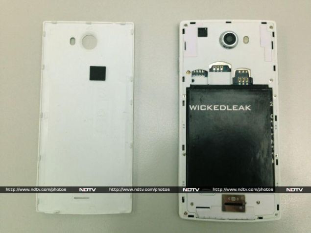
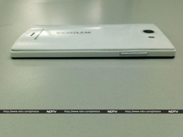
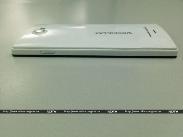
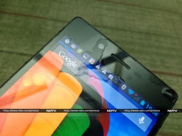
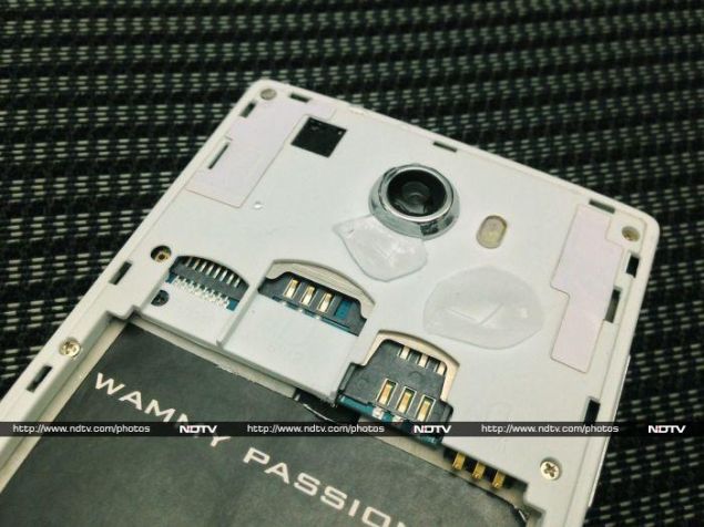
The first phone we received was, frankly, one of the ugliest we've ever seen. It was made of shockingly cheap plastic, with a crude screen-printed Wickedleak logo on the rear. We noticed numerous fabrication issues, such as bumps and fibres in the plastic moulding, clumps and streaks of adhesive all around the screen edge, and a battery that looked like it had been hastily wrapped in discarded paper. The lid was flimsy, and the clasps around the edges were difficult to press shut. Even the buttons felt cheap, and the volume down button made a very loud 'click' sound when pressed.
What's more, the entire phone had a sticky feel to it, which we weren't sure was attributable only to the much-hyped hydrophobic coating. The device didn't just feel icky to hold, but also picked up fluff from our pockets and any surface we happened to put it down on.
Wickedleak_Wammy_Passion_X_rearangle_ndtv.jpg
When we expressed dissatisfaction to Wickedleak, we were informed that the device sent to us was a "review unit" that didn't represent the devices actually on sale. After explaining to them that the point of a review is to inform readers of exactly what they can expect of a device, the company offered to send us a retail unit.
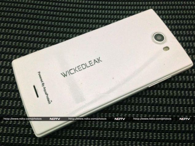
We were expecting the replacement to be a more polished version of what we had already experienced, but as it turns out, the only difference was that the new device had a thinner "AquaProtect" coating. A company representative explained that review units had been given thicker coatings because they had expected them to be subjected to harsher treatment. For the record, we repeated our performance tests on the second unit in order to provide our readers with an accurate idea of what to expect if they buy this product. Performance was the same across both devices.
Wickedleak_Wammy_Passion_X_cover_ndtv.jpg
The second phone had a less sticky feel, but the low quality of the plastic and moulding process was even more apparent on this one. The coating had clearly been applied by hand, since uneven brushstrokes were clearly visible, somewhat like lacquer. The panel was less glossy, but there was no other difference: the edges were still rough, adhesive was still smeared around the screen, and the buttons were still awkward.
Specifications and software
The Wammy Passion X uses a 1.7GHz octa-core processor, making it only the second such product we've reviewed, after the Intex Aqua Octa. Both devices use the same Mediatek MT6592 CPU, which is capable of running all eight cores simultaneously, rather than an arrangement of four more powerful cores and four less powerful ones that hand off tasks to each other based on workload and battery condition.
There's 2GB of RAM and 16GB of onboard storage, which is not bad at all for phones in this price range. Bluetooth 2.1 is supported, not the current common Bluetooth 4.0 standard. Apart from that, the specifications are unsurprising.
Wickedleak_Wammy_Passion_X_left_ndtv.jpg
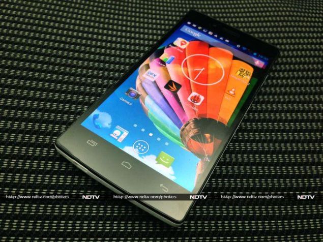
The 5-inch full-HD screen is not especially bright, but it is nice and crisp. With an octa-core processor and sufficiently large battery under the hood, we aren't concerned that it will suck too much power or slow things down.
Incidentally, this is one of the few phones which doesn't come with a headset in the box. You get a charger, USB cable, printed instruction sheet and adhesive screen protector, but that's it.
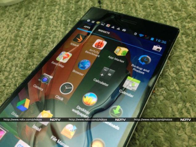
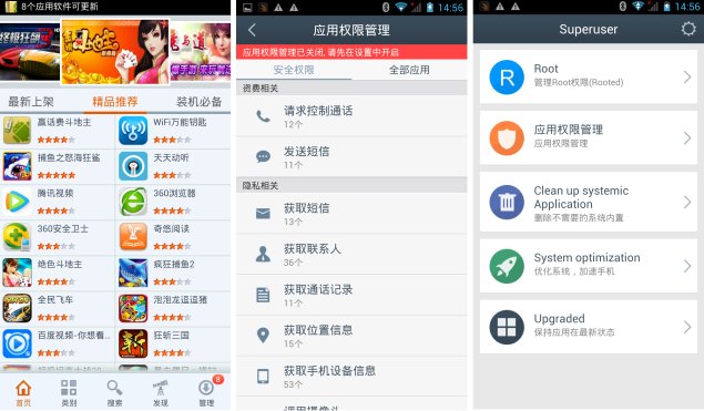
The Wammy Passion X runs Android 4.2.2 with a lightly customised UI. The icons are all different, and the notification and quick settings panels are skinned. Apart from that, Wickedleak includes a large number of Chinese apps that are evidently preloaded by the OEM and then just left there. We encountered a Chinese-language app store, Baidu Maps, and two others that we couldn't decipher the names or purposes of.
Wickedleak_Wammy_Passion_X_right_ndtv.jpg
All Wickedleak devices ship rooted and unlocked. There's another app called Superuser which is in both English and Chinese, which offers options related to phone security and maintenance. Not all sections are dual-language, so we could only makes sense of 'System optimisation', 'Clean up systemic application' (sic) and 'Root'.
Two little apps called Desktop Wallpapers and Themes respectively do pretty much what their names suggest. One lets you choose from a small collection of wallpaper images, and the other lets you switch between four themes, which include wallpaper, icon sets, fonts and colours. Luckly, one of the themes is 'System', which is basically stock Android.
Wickedleak_Wammy_Passion_X_chinese_ndtv.jpg
Another quirk is that when plugged into a computer's USB port, the phone offers a number of options in addition to the usual media transfer protocol and camera modes. A USB mass storage mode is thrown in for Windows XP users, and a Charge Only mode disables all data functions. There's also a USB CD-ROM mode, which mounts the phone as a read-only CD-ROM drive on any PC. The phone's menu says the virtual CD will contain "some useful software", but when we tried it all we found was a 36-page PDF technical manual detailing the physical and electrical characteristics of the USB protocol.
The hydrophobic coating
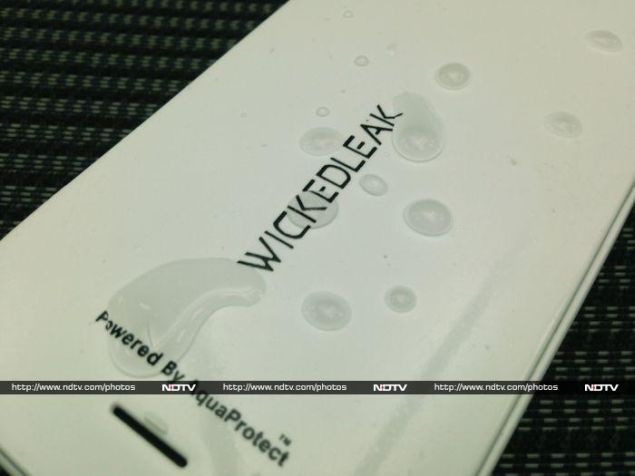
Specifications aside, the most unique feature of the Wammy Passion X is its "super-hydrophobic" AquaProtect coating. We're told by Wickedleak representatives that this is a more effective coating than the ordinary hydrophobic treatment applied to some other phones, and that it covers not only the outside surface but also the insides and the electronic components themselves. The company says each Passion X device can withstand up to 30 minutes of immersion in any liquid including tea, coffee and fizzy drinks.
Wickedleak seems so confident about this coating that it doesn't feel it necessary to provide watertight flaps over the USB and headset ports. The plastic rear flap definitely isn't watertight, so hopefully the "molecular-level" bonding of the AquaProtect coating will protect the slots, ports and other exposed components. The warranty in fact covers one liquid damage incident per device, which is defined as exposure to liquids for up to 30 minutes. There's a simple sensor inside, somewhat like a litmus paper, which will let a service technician determine how much time a device was exposed to liquid for.
Wickedleak_Wammy_Passion_X_waterangle_ndtv.jpg
Our Passion X's box had a printed instruction sheet that strongly discourages users from treating their device as totally waterproof because of the AquaProtect coating, and outlines its capabilities and limitations. It clarifies that the coating covers the insides of the headset and USB ports, but doesn't affect electrical contact or audio quality in any way. It makes it clear that the phone should not be taken swimming or intentionally subjected to liquid damage. In case of exposure, users are instructed to power down their phone, take the battery out, wipe all accessible surfaces, and leave it standing upright for 48 hours without using it. Wickedleak representatives told us that for short-term exposure, it was enough to leave the phone turned off overnight with the battery out.
Although Wickedleak calls the feature AquaProtect (with a trademark symbol), our research found no company claiming to produce such a thing. Wickedleak says it has bought the technology from an Indian firm with ties to an IIT, and that it has big plans to commercialise it in the very near future. It took the company a while to perfect a formulation that would not adversely affect the phone's screen (though a one-glass LCD panel, in which the touch sensor is bonded to the LCD itself, was required) or camera lens. Variations of the coating can be used on cars, ceramic tiles, and even paint.
Wickedleak_Wammy_Passion_X_waterinside_ndtv.jpg
While most Indian companies import their phones fully built from China, this model has to be assembled locally, since the coating is applied here. Wickedleak is understandably not inclined to let others get their hands on the coating material. Thus, even though Wickedleak phones are not exclusive (which means other brands source identical hardware from Chinese OEMs), no other incarnation of this phone will have the same coating.
Despite those claims, we found that the description of its features is almost an exact copy of material published by Liquipel, a California-based company that was in the news last year for demonstrating a super-hydrophobic treatment that could be applied to a number of commercially available phones and other gadgets.
Wickedleak_Wammy_Passion_X_waterdrops_ndtv.jpg
We saw a demo of the Passion X with water simply rolling off it, and briefly tried to recreate the scenario. We did notice the hydrophobic effect: water droplets simply remained on the surface, both with and without the rear cover on. It was easy enough to wipe water away with a cloth, even after leaving the phone in a cup of water for a few minutes. However, the phone suddenly turned itself off at this point.
We left it to dry overnight as described, only to find that it didn't want to come on at all the next morning. The screen showed an illustration of the battery with 1% remaining, after which it refused to charge. We then left it for another few hours, after which it came on, with the battery showing 44% full. However, the phone's charge level kept jumping around, even when it was just plugged in and doing nothing. It's possible that the battery itself, which isn't coated, could have been affected. We therefore ran our battery test only on the second unit, which had not yet been subjected to water exposure.
Wickedleak_Wammy_Passion_X_buttons_ndtv.jpg
Performance and Camera
Despite our problems with the phone's looks, we have to acknowledge that it did fairly well in our tests. We found the Wammy Passion X's performance to be at par with that of the Intex Aqua Octa. AnTuTu gave us a score of 26,290, and Quadrant notched up 134,375 points overall. Even though the eight Mediatek ARM cores can provide a fair bit of processing grunt, the integrated Mali GPU is clearly not a powerhouse. Graphics scores were not very impressive, with only 9.3fps in GFXbench and 4624 points in 3DMark's Ice Storm Extreme test run.
In ordinary usage, we found the phone to be consistently snappy and responsive. Android feels great, and even loading a large number of tabs in the browser didn't cause a slowdown. Games that aren't too graphically intensive will be quite enjoyable.
The Wammy Passion X's screen is sharp when seen head-on, but tends to look discoloured at angles greater than 30 degrees. We also noticed that the unit got pretty warm while we were playing games and watching videos.
Wickedleak_Wammy_Passion_X_camsample.jpg
(Click to see full size)
The battery lasted for only 4 hours and 21 minutes in our video loop test, which was a bit too little for our liking. Call quality was decent, although people on the other end of the line reported differences in volume depending on how we held the phone.
The rear camera is rated at 13 megapixels. We were happy enough with the photos and videos it took in daylight. Detail was surprisingly well captured, and there was only very light noise. However we weren't that thrilled with the colour reproduction. Photos seemed just a bit dull, and had a warm cast to them. Photos taken in low light were also pretty decent, and although the amount of noise was significantly higher, objects were clearly discernible.
Wickedleak_Wammy_Passion_X_slots_ndtv.jpg
Verdict
Wickedleak's super-hydrophobic coating is definitely a unique feature and the company is correct in that it will set it apart in the market. However, that doesn't mean that this phone is waterproof or that you can feel free to dunk it in water for fun every now and then. It should be okay after getting wet in the rain or having a drink spill on it, but that's the extent of how useful the coating is.
The phone is otherwise pretty capable for its price. You'll get a powerful processor and decent specifications, along with a crisp, high-res screen. The Wammy Passion X's biggest problem is that it just doesn't look or feel good enough. If you don't care about the plastic texture and general construction quality (or if you can find a nice-looking case that covers pretty much every surface), this is a decent enough phone to buy.

Wickedleak Wammy Passion X in pictures
  • Design
  • Display
  • Software
  • Performance
  • Battery life
  • Camera
  • Value for money
  • Good
  • Good performance
  • Full-HD screen
  • Resistant to mild liquid damage
  • Pretty good camera
  • Bad
  • Super-hydrophobic coating makes the phone uncomfortable to hold
  • Sub-par materials and construction quality
0 comments